Humrichouser
Product Designer

Introduction
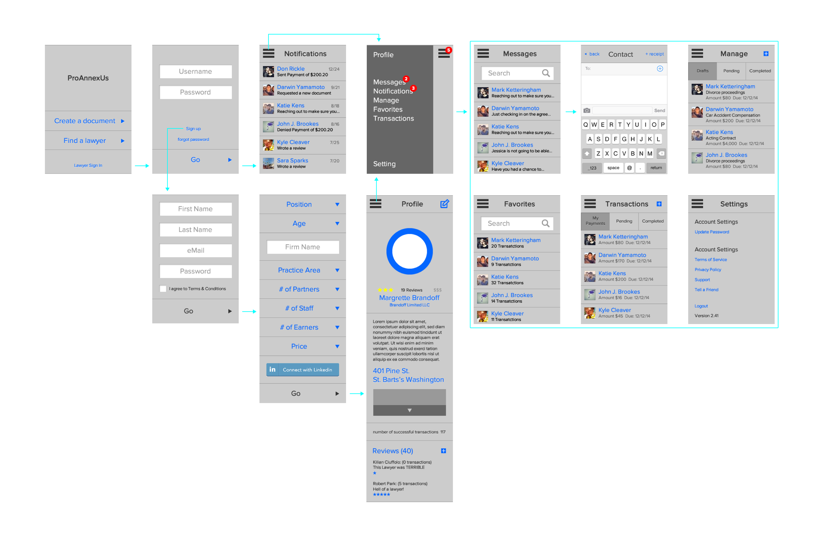
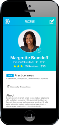
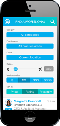
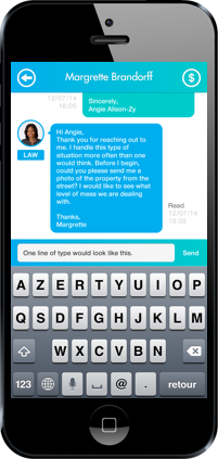
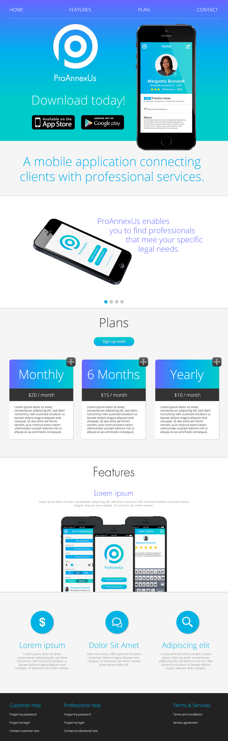
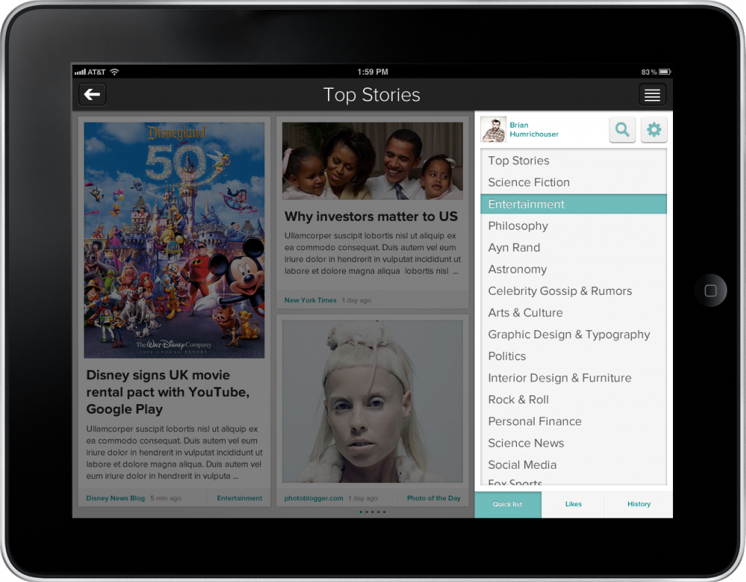
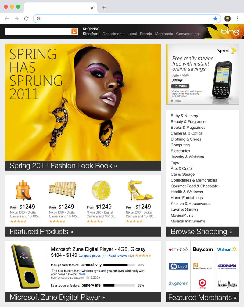
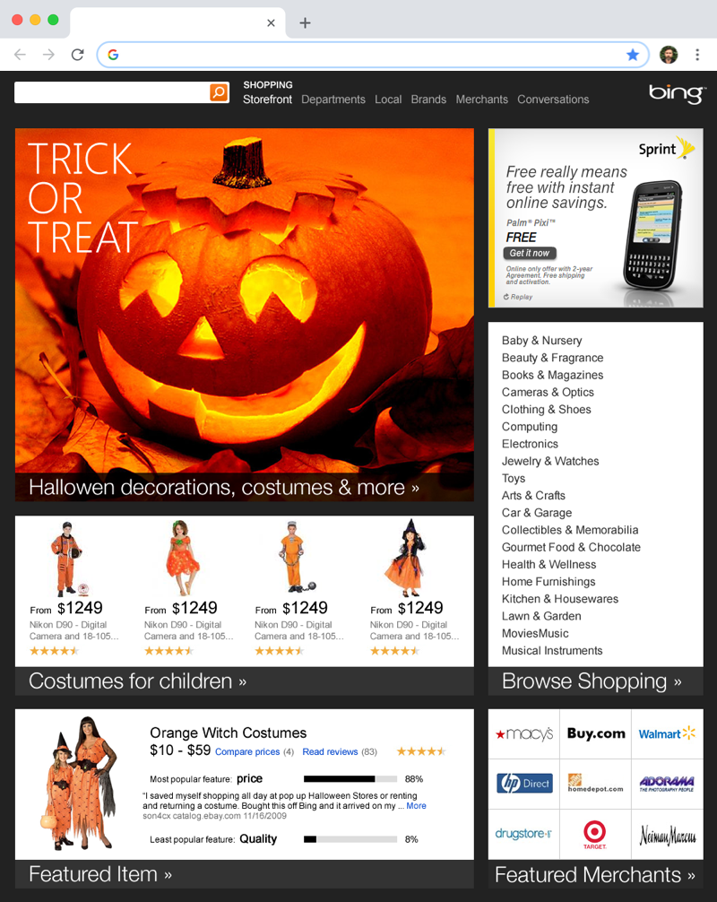
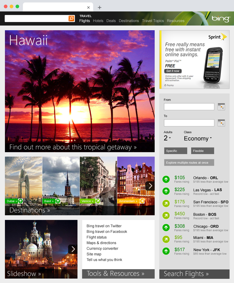
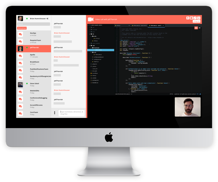
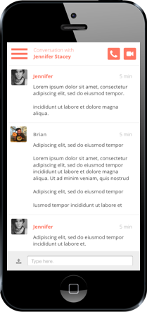
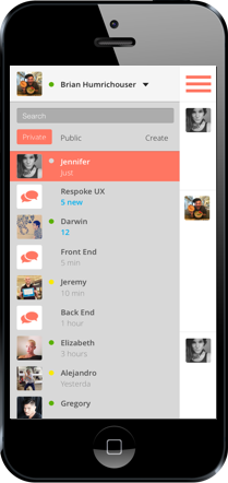
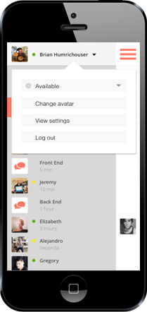
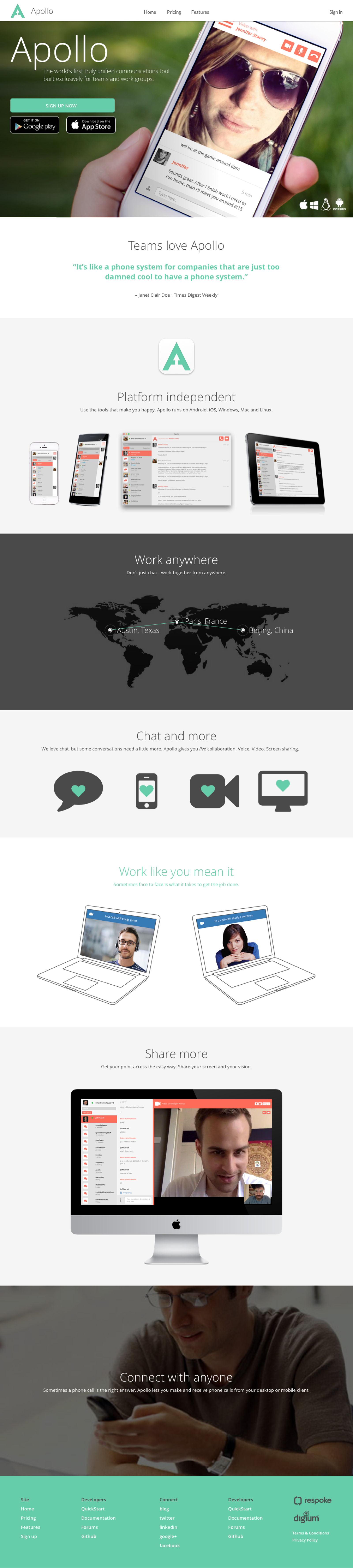
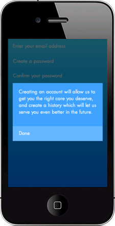
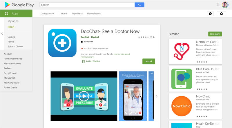
I am a passionate designer, who has spent over 12 years celebrating design and creating delightful experiences. I understand the design process from beginning to end, and have led many successful products to launch. I am experienced in a broad spectrum of UX, UI, and visual tasks, and am comfortable designing within large ecosystems like Amazon and Microsoft, as well as leading creative efforts as sole designer on small teams.


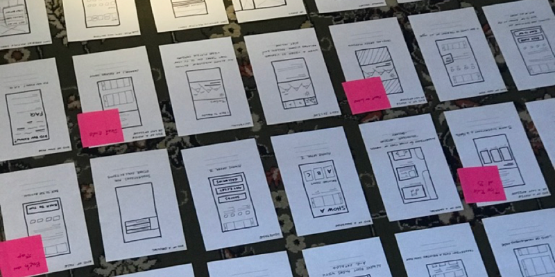
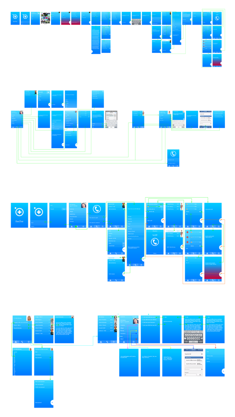
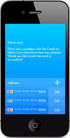
Process   Feel // Formulate // Fashion


Case study 1 of 8
IMDb Freedive

Company. Amazon
Role. UX Designer

Platforms. Web, Mobile, Tablet
Year. 2019

Objective
Millions of Amazon Prime customers enjoy a large catalog of movies and series. An idea developed to provide content to non-Prime customers as well —by way of movies and series that are free with ads. We introduced it as a channel called IMDb Freedive.

Outcome
The channel launch was successful and well-received by both customers and critics. Ad revenue was +48% vs plan, shortly after launch. There was a low negative perception, as less than 20 negative contacts related to ads of 2.9MM viewers were received. The channel continues to this day under the new name IMDb TV.

Challenges
The current Prime Video framework had been designed to handle only 2 types of content: Free with Prime, and For Purchase. Free with Ads introduced a third type of content, which created concerns around customer confusion. It was crucial to make obvious that this content was unique to the rest of the catalog.

Takeaways
Customers are comfortable with content that is free with ads alongside their paid catalog, as long as it is distinctly called-out. It is perceived as additional content available on the service at no extra cost. Additionally, now non-Prime customers can enjoy great content on Prime Video.


Case study 7 of 8
ProAnnexUs

Company. CleverTech
Role. UX/UI Designer

Platforms. iPhone
Year. 2014

Objective
There are many types of lawyers all specializing in an assortment of legal matters. It is often difficult to find a good match. ProAnnexUs is a solution to the often uncomfortable and intimidating experience of seeking legal help. Sort legal professionals by type, distance and cost to pinpoint viable options right for you.

Outcome
A full application released in the Apple, Amazon and Android stores. Qualified lawyers, specializing in niche aspects of the law have been connected to real customers seeking advice and counselling. Proannexus provides services to those in need.

Challenges
We had a lot of data we were excited to use. Balancing between too much customization and not enough, takes a delicate posture. User research led us to the result that 3 simple sorts were much more easily understood than anything more.

Takeaways
This was a niche problem in need of a solution, and ProAnnexUs solves it. Keeping the app simple is key in it’s success. I realized on this project that if you as a team member think an experience might be confusing, knowing all the details and insights you know, it will definitely be confusing to the user. Less is more.

Brainstorming
For me, it is important to begin each project by letting my mind go wild and putting pen to paper. Tearing paper and rearranging it. Doodling, drafting, and shifting. It can seem a bit old school to some, but I believe beginning with your hands is an important part of the process. It saves a lot of time in the long run.

User Flows
User flows uncover hidden obstacles and reveal seamless pathways users can take during their journeys. Below you can see two examples of wireframes I created. Regardless of which path a user takes, it is my job to make sure they always get to their destination.

Prototypes
High fidelity screens establish a realistic experience and encourage useful stakeholder feedback. I prefer to sit down with my developers, PMs and teammates and show them my designs and receive feedback in real time. As a user-centric designer, I am never married to my designs. I am always informed by data and pride myself in being adaptable and flexible.

Research
I performed guerilla AB testing throughout the design process. I always want to make sure I'm being led by the user and satisfying their needs throughout the process. To find which notifications placement was more discoverable, I sent these screens to friends and family and asked them to tell me how many notifications they had received and how long it took them to find out. I analyzed the data. Option A was the clear winner.

Redlines
Designs are carefully redlined before being handed off to development for guidance. I take redlines very seriously. The more clear and concise detail I can provide to the developer, the easier it will be for them to hit our objectives and deadlines without miscommunication or extra steps.

Final deliverables
My main goal is always to delight customers with an unexpectedly joyful and smooth experience. This does not happen by simply making something beautiful. It has to be useful, too. I know I’ve succeeded when I solve problems in an elegant way.


Case study 2 of 8
Zite WP7

Company. Zite
Role. Lead Designer

Platforms. WP7
Year. 2012

Objective
Before the launch of WP7, several existing applications on Android and iOS were offered an opportunity to team up with a Microsoft representative to create a version for WP7. This would supply customers with a solid suite of applications in the WP7 store ready for download, on the day of launch. Zite was one of these chosen applications.

Outcome
The WP7 app gave Zite a whole new look, yet it was still the same at its core. We were pleased with the WP7 standards telling our story. UI patterns were different, but the rhythm and pace of the app were familiar; it felt like a part of the family. Zite for WP7 was complete and available in the App Store at launch.

Challenges
The WP7 standards were bold, unique, and quite different from iOS and Android. We needed to let go of our attachment to the existing UX/UX and focus on what makes the app truly delightful. We looked at the tools, components and patterns in the WP7 HIG, and embraced the beauty native to the platform.

Takeaways
Using a new set of UI and patterns is challenging when an application already exists. One must separate UI and patterns from the core of the product. Understand and adopt the new UI. Discover what is unique and beautiful about it. Then, pull from the strengths of both, and create something new yet familiar.

Information architecture
Zite WP7 site map


Case study 3 of 8
Zite iPad

Company. Zite
Role. Lead Designer

Platforms. iPad
Year. 2013

Objective
A successful iPad application, powered by an industry-breaking algorithm, Zite delivered amazingly relevant content to customers in the form of a digital magazine. As a startup with a team of 4, I was brought on as the fifth member, and it was my responsibility to refresh the look and feel of the existing application.

Outcome
The final designs offer a fresh look, utilizing a card metaphor to separate articles and unify contingent data. A back button provides readers with solid orientation to navigate linearly through the service, while an omnipresent menu allows for quick access to frequented categories, liked articles, history, settings and profile.

Challenges
Achieving a balance between too much information and not enough was the greatest challenge. This design offers up to 6 articles per page. The task was to provide enough information to entice the reader without overwhelming them.

Takeaways
A design refresh of an incredible product exemplifies a beautiful marriage between functionality and form. A card metaphor worked very well to organize stories, and keep them separated visually. A consistent typographical hierarchy provides order.


Case study 4 of 8
Bing shopping

Company. Microsoft
Role. UX/UI Designer

Platforms. web
Year. 2011

Objective
Tasked to experiment with a full visual update for Bing domains, I was put on a small team of talented designers and asked to explore an alternative UI for the great content Bing provides. While designing a family through hierarchy and uniformity, I used color and large imagery to make them siblings, not twins.

Outcome
Unique yet unified pages utilizing modules, which flex along a consistent, familiar grid. Products are filtered by color to distinguish domains in an interesting, playful way. Large typography establishes hierarchy and unifes the pages.

Challenges
Bing is a gigantic ecosystem with histories of code. The changes we could make had to be incredibly sensible. Keeping development in mind, I wanted to make simple and minimal CSS and HTML changes that created large impacts. This led me to experiment with colors and images.

Takeaways
Images are elements unique to each page. Utilizing their subject matter to celebrate domains and individualize their appearances with no code changes, or changes to UX/UI was a successful idea. Utilizing existing color filtering on images technology makes a big splash with a low code cost.


Case study 5 of 8
Bing entertainment

Company. Microsoft
Role. UX/UI Designer

Platforms. mobile, web, tablet
Year. 2011

Objective
Centralize information around entertainment entities to create a one stop shop for all the things to know about (ex.) Katy Perry. Create a system of hub pages linking to data types such as albums, songs, lyrics, videos, etc. on subpages to fully capture in detail, all there is to know about said entity.

Outcome
Entity level pages house modular units which display top level previews and offer entry points to detail pages about nuanced aspects of a limitless variety. These modules populate only when there is enough data to support detail pages.

Challenges
We needed a system that populated varied amounts and types of data depending on how much we had about a particular entity. Also, we had to keep pages across various topics uniform. This was tough as different entities required different data types catered to their unique data. We kept consistency through the use of common visual patterns.

Takeaways
Modular systems work well to organize wide arrays of information. They create a hierarchy with which customers are familiar. Research, however, showed that our customers felt a bit of information overload. I learned that often people prefer to be led down a rabbit hole, rather than provided many paths.


Case study 8 of 8
Apollo

Company. Digium
Role. UX/UI Designer

Platforms. Android, iPhone, tablet, web
Year. 2015

Objective
Create an application that can keep a team connected through their phones, computers and tablets, via screen sharing, video chat, text chat, phone calling, groups, statuses. and more. The product would be released in sprints, using the agile system.

Outcome
We developed a multifaceted communications software. Syncing with mobile, tablet and web technology, keeping users up to date and in context at all times from anywhere, and providing a centralized location to keep all matters of project development.

Challenges
One challenge was developing a system which created a home for the plethora of features, while still presenting a clean UX/UI. Another challenge was releasing the application in sprints. We were working with a moving target.

Takeaways
Working in sprints was a great learning experience. The team was using the product as it was being developed. This allowed for informed feedback, and genuine user scenarios that would manifest naturally. It was a small team and we were able to make tweaks swiftly, and the product blossomed from this process.


Case study 6 of 8
DocChat

Company. CleverTech
Role. UX/UI Designer

Platforms. iPhone
Year. 2014

Objective
Connect people with doctors and medical professionals, regardless of location. Reduce time and energy spent getting to a physical location for symptoms that can be treated remotely. Allow doctors anywhere to send prescriptions to pharmacies near remote patients’ residences.

Outcome
An application that provides an on call doctor, 24 hours a day, to consult patients using video conferencing. This allows access to medical care for customers wherever they have their smartphones, and provides opportunities for medical professionals to reach more clients.

Challenges
We wanted the application to look modern and hip, and chose an edgy UI that was quite bold for its time. Adversely, perhaps, we were collecting sensitive information from clients and providing them with a very serious service. Feedback was received that the UI didn’t “feel” secure. We adjusted the design.

Takeaways
This was a lesson about the trustworthiness of traditional UI inputs, especially when it comes to collecting sensitive information. We can push the envelope, and we must experiment, yet when it comes to health, and private information, we need to guarantee our designs keep our customers comfortable.

Brainstorming
It is important to begin by brainstorming.

User Flows
User flows uncover hidden obstacales and reveal seamless pathways users can take durig thier journeys.

Prototypes
High fidelity screens establish a realistic experience to encourage useful stakeholder feedback.

Launch
Develop app and enter it into the market place.